Watch
great cinema
great cinema
That takes you somewhere.
Hand-picked by us.
for you.
for you.
Try 7 Days Free
By clicking 'Get started' you are indicating that you have read and agree to the Terms of Service and Privacy
From cult classics to modern masterpieces.
From the greatest ever directors,
to the greatest new directors.
Films from everywhere on earth.
From the greatest ever directors,
to the greatest new directors.
Films from everywhere on earth.
a movie ticket every week.
+
all the films you can stream.

in cinemas this week
The Feeling That the Time for Doing Something Has PassedJoanna Arnow
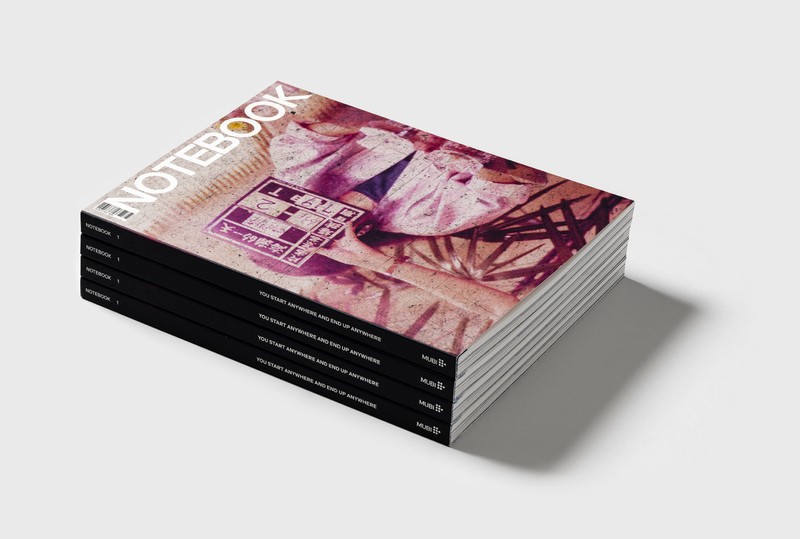
Read a print magazine devoted to the art and the culture of cinema.
Created, prepared, and published by MUBI. Receive two beautiful issues a year. Available worldwide with a magazine subscription.
 Learn more
STREAM TRULY GREAT CINEMA.
Try 7 Days Free
By clicking 'Get started' you are indicating that you have read and agree to the Terms of Service and Privacy
This site is protected by reCAPTCHA and the Google Privacy Policy and Terms of Service apply.